Logo Ideas for Your New Outsourcing Company
Published on: October 14, 2024
In many outsourcing company startups, the simplest and most important decision you have to make in outlining your brand is your logo. A good logo, as it has been described several times in this text, is an effective symbol that encompasses the company’s values the level of professionalism to offer, and the services given. The outsourcing industry is quite saturated, which means that a logo should be the equivalent of your company’s professionalism and speed, which will create an impression on a potential customer.
Outsourcing and Understanding the Value of Branding
In the field of BPO outsourcing, your logo should immediately convey expertise, innovation, and a client-focused approach. It should reflect what you do and offer, no matter if you focus on back-office services or offer customer support or specific solutions. Take BOSBPO Outsourcing Company, for instance, where a sleek and modern design helps project professionalism. The simplicity of their logo is due to the efficient services they offer, so their logo is unique in the market. Such a design can serve to make your outsourcing business look credible and willing to deliver maximum efficiency.
The design concepts are an essential factor when creating the logo of your firm.
When designing a logo for your BPO outsourcing company, consider simplicity and clarity. It is typically better to keep things simple in this industry, as this kind of design looks more professional. Choosing simple geometric forms means that your company is not joking about providing services that are properly coordinated and reliable. Another feature is the correct and proper use of color as well.
And therefore blue is very popular among outsourcing businesses because can be associated with trust, effectiveness, and stability.
Hence the green color might be associated with growth, and where change and forward-thinking methods are adopted the black color might be associated with strength and authority.
They also have a direct influence on your logo and can be used to create a stronger visual appearance. Using a grayscale font will help the logo look more credible while using futuristic and clean fonts will symbolize the flexibility of your company. The list of symbols or icons can also help in strengthening your brand identity. For instance, in the case of forms having arrow-like or smooth curves the link with fast work is established while in the case of components like check marks, there is a relation between accuracy and the work completed.
Creating a Lasting Impression
Your logo is often the first point of contact with potential clients, especially in the BPO outsourcing industry, where first impressions matter. A good logo must therefore be eye-pleasing and convey your purpose at a glance. The organization’s logo should be related to business, good performance, and credibility among the clients. For example, BOSBPO Outsourcing Company’s design strikes a perfect balance between modernity and professionalism, leaving no doubt about the company’s expertise.

These principles when employed in logo development will aid in setting your company as a leader in the outsourcing business.
How you can have your logo reflect your basic organizational values.
Your logo must give out a reflection of the basic attributes of your outsourcing business. No matter whether emphasis is laid on quality, customer satisfaction, or new solutions – all this has to be proclaimed through design but very subtly. A logo that aligns with your values will help attract clients who resonate with your approach to BPO outsourcing. For example, if your business is all about speed, then if you are to use shapes, make them dynamic or if you wish to show a form of movement then this can be quickly and easily relatable. Likewise, if you need people to place their faith in you as well as rely on extended cooperation, a stable hierarchy could work as a guarantee of good design.
Timelessness and Versatility
A major decision when creating a logo is the fact that it has to be timeless. The design must be contemporary, but not art nouveau so that someone does not look at the logo after a year or two and think they got it wrong. A timeless logo ensures that as your BPO company grows and evolves, your brand image remains consistent. Flexibility is equally important; the logo needs to appear visually appealing whether used on cards or signs –Physical or electronic. Easily scalable and easily transmitted visually, it remains visually striking whether large or small or in any medium.

Building Brand Recognition
Finally, a professional design logo helps in maintaining the long-term brand image of the product. Over time as your outsourcing company is created in the marketplace, the clients are likely to associate your logo with the quality of service that is offered. You build up an asset that represents your business brand vis-à-vis that of your competitors in the market. With a thoughtful design strategy, your logo will not only be memorable but will also reinforce your reputation for excellence in BPO. Just as any Outsourcing Company has done with its logo, your design can become a powerful symbol of reliability and professionalism in the industry.
| Minimalist Design |
A clean, simple logo design with minimal elements, focusing on professionalism and clarity, which conveys efficiency in outsourcing services. |
| Global Symbol |
Incorporating a globe or world map into the logo to emphasize the company’s global reach and international outsourcing capabilities. |
| Handshake Icon |
A logo that features a handshake to symbolize partnership, trust, and collaboration between your company and its clients. |
| Abstract Shapes |
Using abstract shapes and forms to represent innovation and modernity, conveying a forward-thinking approach to outsourcing solutions. |
| Speed Motion Lines |
Adding motion lines to the logo to represent speed, agility, and quick turnaround times, key factors in outsourcing businesses. |
| Technology Integration |
Featuring tech-inspired elements like circuits or digital symbols to highlight a focus on tech-driven, innovative outsourcing solutions. |
| Typography Focus |
A logo that focuses on unique typography to make the company name stand out, reflecting a strong brand identity and professionalism. |
| Professional Shield |
Including a shield symbol to communicate reliability, security, and protection of client's interests in outsourcing business operations. |
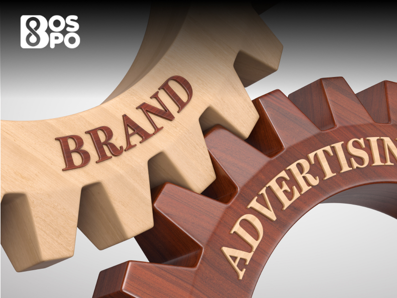
| Gear or Cog Symbol |
Incorporating gears or cogs to represent smooth operational processes, efficiency, and optimization in business process outsourcing. |
| People or Team Icon |
A design that highlights people or team symbols, showcasing the human element of collaboration and teamwork in outsourcing services. |
| Check Mark Emblem |
A logo that includes a check mark to symbolize accuracy, success, and the completion of tasks with precision in outsourced projects. |
| Infinity Symbol |
Using an infinity loop to represent continuity, long-term partnerships, and a never-ending cycle of growth in outsourcing relationships. |
| Modern Font with Icon |
Combining modern fonts with a small, recognizable icon to create a sleek, professional look that reflects the future-forward nature of outsourcing. |
| Circular Design |
A circular logo design that symbolizes completeness, unity, and the full cycle of services offered by the outsourcing company. |
| Puzzle Piece Icon |
Including a puzzle piece to signify how your outsourcing company fits perfectly into the client's business needs and goals. |
| Shield and Key |
A combination of a shield and a key symbol to represent security, trust, and access to crucial business operations. |
| Triangle or Pyramid Shape |
Using a triangle or pyramid in the logo to convey stability, strength, and a strong foundation in outsourcing services. |
| Growth Arrow |
Featuring an arrow pointing upwards to symbolize growth, success, and upward movement in business process management. |
| Minimalist Monogram |
A monogram-style logo using the initials of the company name, offering a sophisticated and recognizable visual identity. |
| Globe and Network Lines |
A globe with interconnected lines to show the outsourcing company's ability to network and connect with businesses across the world. |
Summary
To sum up, making a strong, memorable image for your BPO outsourcing company is important for building trust with clients and giving your brand a name. Your logo can be a strong way to set your business apart and ensure its long-term success if you focus on keeping it simple, using classic design elements, and making sure it clearly shows what your company stands for.
Read Also: BPO Company Name Ideas
FAQs
Q1) What are the most important parts of a brand for a business process outsourcing company?
A good name for a business process outsourcing (BPO) company should be simple, professional, and show what the company stands for. Simple design, the right color choice, a good font style, and the use of visual marks that show speed and dependability are all part of this.
Q2) Could you explain what it means for outsourcing companies to use a simple design?
People want outsourced companies to look and feel professional, clear, and efficient, so they like things to be simple. Because they don't take up too much space, prospects for the business are more likely to be affected by how clean and effective the services will be when they look at the logo.
Q3) If you're a BPO company, what colors should you use for your logo?
Blue is a popular color for BPO outsourcing firms because it makes people feel safe, efficient, and calm. In other situations, the color green can mean "new" and the color black can mean "strong" and "durable."
Q4) This made me wonder how the logo helps build brand recognition in the outsourcing business.
Not only does a good logo help people remember your company, it also helps them form a picture of your brand. Over time, clients will associate your logo with good service, which helps build brand awareness in the outsourcing business.
Tags In